Author: admin
Host and Guest
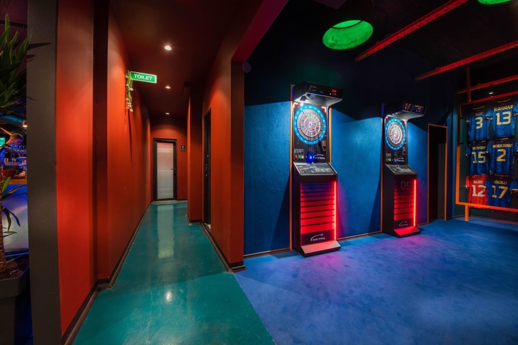
Where sport meets bar.
Materials can be what we demand them to be.
Designed as a vibrant meeting point for sports enthusiasts and casual visitors alike, Host & Guest Sports Bar combines the energy of a game lounge with the comfort of a social hub. The design features bold contrasts, electric blue lighting, warm orange accents, and industrial textures that define the atmosphere.
The open layout centers around a metallic bar counter illuminated by dynamic LED hues, with custom seating zones that balance intimacy and excitement. Mesh partitions, exposed ducts, and color-coded pathways create a spatial rhythm reminiscent of a stadium tunnel.
Large screens, jersey displays, darts, and a red-felt billiard table complete the experience, celebrating sports culture through architecture that is both playful and precise.
Pink Dreams
110 m2 | Prishtina, Kosova [built 2020]
BS home
Minimal with a shine..
Del Posto
A task was in front of us: Add an adjacent space to the existing venue that would serve for a fine dining experience while preserving the ambiance of the existing venue and parallelly upgrade the existing venue with minimal interventions. The aim was to create a sophisticated environment, where the old and the new fuse into one.
Telegrafi HQ
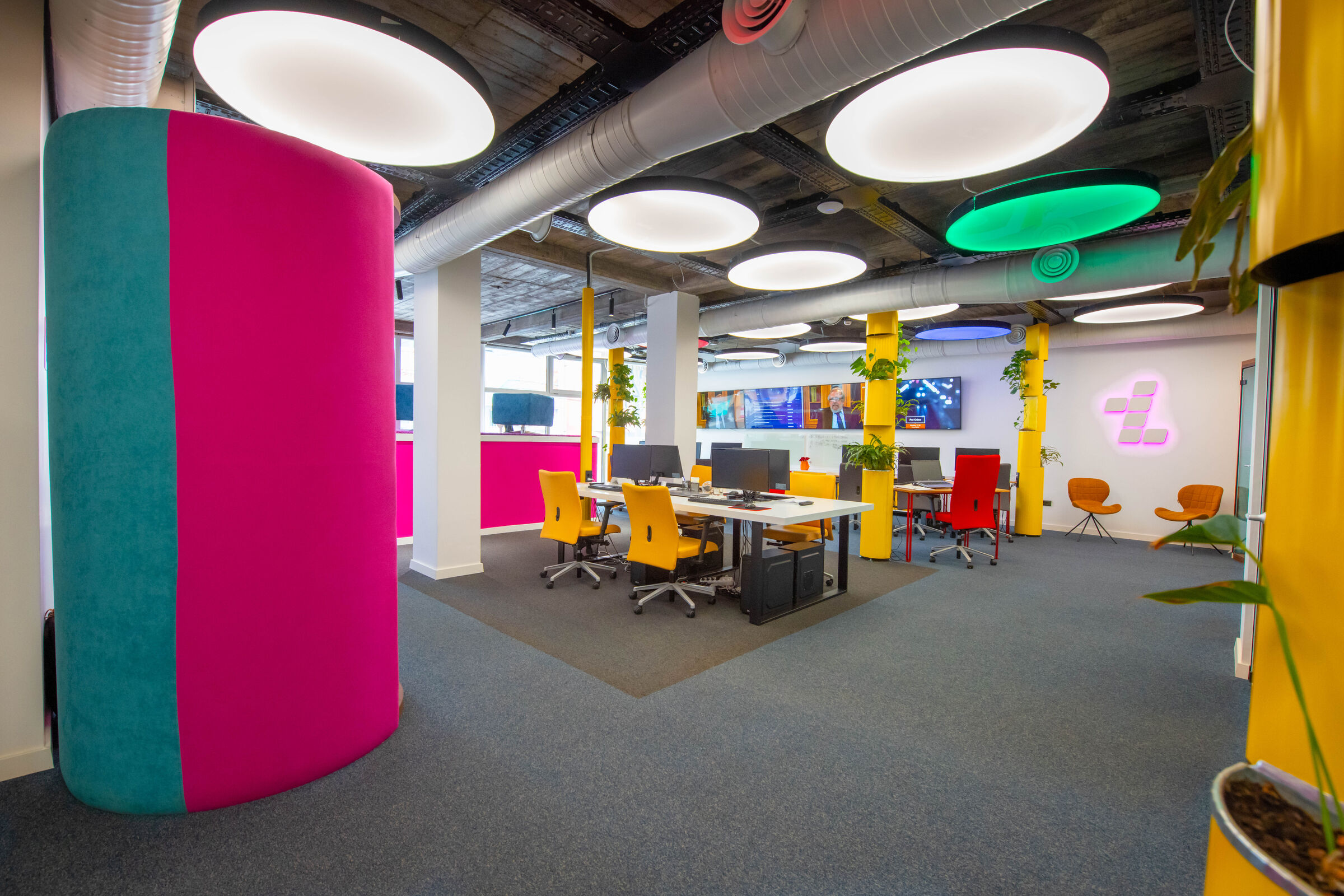
Telegrafi offices – Moving still space
Our client, Telegrafi.com is one of pioneering online media as well as the most forward-thinking one in the region. Working in the online world, can be often translated into sedentary activity, with less social interactions, with employers often reporting that it is harder to switch off, and that they resort to unhealthy lifestyle. Being aware of this, we thought we could tackle these drawbacks of working online, with design. Thus, the underlying theme of design in Telegrafi offices is “Technology as an invisible bond between people and space”, giving the latter much more agency than it usually has. A space that has agency is more alive, it interacts and gets to know the people it interacts with, and by developing through learning, it achieves a long-term symbiosis between the two. This was done using smart systems, which analogous to the role of the brain in the nervous system, control, modify, adapt every aspect of the space, ensuring a work environment that is focused on the wellbeing of workers meanwhile maximizing work effectiveness. An innovative use of such smart systems was incorporated in 26 round lights custom built for the space with LED strips on the perimeter fading towards the center creating a unique effect of natural light, a contrast to the monotone plain light surfaces used nowadays as a result of technological advancement. When these same 26 lights that are equipped with RGB light are put in work by a smart system, and some of them “the odd” ones, and are assigned random colors which discretely change places throughout the day create a feeling of movement and passing of time, similar to the notion of how each time we look at the sun during a day, we perceive its position to be moving . To address the unhealthy lifestyle so common in the 21th century workplace, every hour lights start a light show, as a way of reminding people to stand up and move. Furthermore, the smart system can use these lights to personalize the space for event such as birthdays, anniversaries, national holidays, welcoming guests, changing the mood etc., thus creating a unique context related perception of space. Also, on a more functional level, since the entire space is intended for shooting of various types of visual materials, they serve an additional purpose, that of creating sceneries & intros for shows.
Element design is rather simple, with no elements that serve as only decoration. Every element has a function, with some of the elements even exceeding their primary function, for example the greenery stands are also used as an installation duct, enable cables to reach tables from the ceiling mounted cable trays, as we named them “Power Plants”. The ceilings were left untouched, bare concrete, with metallic black painted cable trays put in grid so every position on the ground has accessible installation. Seating layout in designed in a non-orderly, non-hierarchal fashion, providing a sense of freedom to workers. All journalists work in the same space, divided in two zones, each consisting of 10 stations. Some more private working areas such as the meeting box, phone booth, transcript & video-chat box, were also integrated into the design due to the competing needs the space was supposed to meet, that of a co-working space, and of a quiet, private areas to work and handle delicate information, with an additional role of one of these areas (The meeting box), that serves as a shooting setting for a short online show called “Boxed” . The second floor of the offices is dedicated for executive staff, financiers, sales and other administrative staff that are accommodated in four offices. The floor also has a training area, a meeting room, all linked via a hallway/waiting area, dominated by a bold pink cushion seating, and common kitchenette/bar.
4 llulla Hotel
Minimal cozy hotel in a heart of Prishtina.
ATOMI
Gifted students “Ice and Fire club”
Having a rather challenging brief of incorporating multiple functions of being a cinema, debate club, book club as well as a space for group meetings, nonformal lectures and a collaborative/working space we had to come up with an innovative way of addressing the client’s needs in a cohesive space.
The debate space: The orange, blue walls was a reference to the Game of Thrones Ice and Fire theme as well as to the opposing teams in a debate context, and it is completed with accompanying wooden chairs and table of the same color giving this scheme a clean elegant look. The monochromatic effect was used so it wouldn’t draw attention to itself, enabling the content “the debaters and their arguments” shine. The blue and orange go well together, producing a soothing effect that is very pleasant for the eyes. This space also addresses the need for a collaborative/working space offering a 6-person seating on each side.
The book club: The remaining space was painted with baby pink, known to have a relaxing effect, much needed in a recreational environment for the highly gifted. To accommodate the growing number of the books the institution had, two wooden shelves were built. Additional book space was given in the white table at the center of the space. The white table together with the informal seating arrangement serves as a space for the book club. The choice of the round table was made to encourage sharing, collaboration and a sense of togetherness.
The cinema: A step seating was designed due to its flexible and comfortable nature. It accommodates x people and has wheals and can be reconfigured for any use. The main aim with this was to bring people sitting closer together, and to offer a comfortable way to assemble a large or small group without taking over an entire space.
Nonformal lectures space: The space as a whole was conceptualized to be appropriate for nonformal lectures. Bean bags, the step seating and the white table can be easily be moved as needed, leaving enough space for a lecturer to use the white board behind, also ensuring visibility and closeness to each participant. With its clustered seating the space ensures all students are equally engaged and have equal proximity to the presenter, promoting collaboration and connectedness.
Assessment & Psychotherapy space
The space had to address to opposing needs, that of a “well lit, clean, neutral, non- biased’ intelligence assessment area as well as a “welcoming, relaxing, cozy” psychotherapy area. This was achieved once again by using color division within the space.
The assessment area was put by the window, to enable the use of natural light, with extra lighting for special needs of the candidates. A white table was used for its neutral, blank slate properties, in order not to compromise the delicate testing process. The walls are in baby pink, offering once again a soothing space and reducing the potential stress test takers may have. Wall shelving is used to accommodate psychotherapy books and handout materials.
For the psychotherapy area it was important that the space doesn’t trigger any negative response and doesn’t associate to a traumatic event/ memory therefore the space was painted mint green after extensive research on the possible effects different colors can have on human’s mood. According to research with psychotherapy clients, certain shades of pink and green are the dominant preference and evoke tranquility and serenity. Two complementary maroon colored cushion chairs are offered for comfortable seating while in session. A ceiling lights fixtures and a floor lamp provide means of control for ambiance, mood and how you use the room. Abstract paintings with playful tints and shades of both pink and green were used to achieve a unified space.
QAKA home
A serene and contemporary living space designed with clarity and warmth. The apartment blends muted tones of sage green and beige with contrasting black details to define depth and rhythm throughout the interior. A continuous visual flow connects the kitchen, dining, and living areas, where textures of wood, matte lacquer, and fabric create a calm yet sophisticated atmosphere. Subtle lighting accents and abstract wall art enhance the apartment’s modern aesthetic while keeping it intimate and livable.
REDBOX ent.
A bold interior for the home of Albania’s leading music producer — REDBOX Entertainment. The space blends deep red tones with warm wood flooring and industrial detailing, creating an expressive environment that mirrors the creative energy of the studio. Minimalist lighting lines emphasize rhythm and movement, while the green textured wall and metal grid divider add contrast and personality.
BK photostudio
75m2 | Peja, Kosovë [built 2019] Photos: Berat Kabashi
L’angolo
100 m2 | Hamburg, Germany [built 2019]
REDONI CB
6400m2 | Prishtinë, Kosovë [2019-2020]
BARBERSHOP LUX
30m2 | Prishtinë, Kosovë [built 2019] Photos: Berat Kabashi
Kolegji ISPE
The new ISPE College building redefines academic space through openness, structure, and light. Elevated volumes wrapped in glass and framed by slender white columns create a transparent and inviting atmosphere. Natural materials—brick, wood, and concrete—express honesty and warmth, while the rhythmic façade and generous overhangs emphasize balance between function and architectural clarity.
LIPS bistro
70m2 | Prishtinë, Kosovë [built 2018]
JACK lives here
Located on Peja’s lively promenade, this intimate bar blends industrial warmth with urban elegance. The interior combines wood, metal, and red accents to create a cozy yet vibrant atmosphere. Ambient lighting and soft textures invite guests to relax, while the open façade connects the interior with the street life outside, making it a perfect spot from day to night.
Photography | Berat Kabashi
AI flat
70m2 | Prishtinë, Kosovë [built 2019] Photos: Berat Kabashi
Mountain house
130m2 | Kosovë [to be built]
NBS home
Warm tones, crafted wood details, and soft lighting define this refined living space. The open plan seamlessly connects the kitchen, dining, and lounge, creating a calm rhythm of everyday life. Natural oak, pastel walls, and abstract art bring both serenity and sophistication, while custom wood slats and ceiling elements give the interior its unique architectural identity.
GGB home
300m2 | Bërnice, Prishtinë [to be built]
Mello marina bar
800m2 | Durrës, Shqipëri [September 2017 starting] ![]()
URBAN
80m2 | Turnkey [ready project]
LIPS caffe
Warm, indulgent, and playfully sophisticated — Lips Lounge merges vintage charm with a modern sensual edge. Exposed brick, red velvet seating, and golden ventilation pipes shape an atmosphere that feels both intimate and theatrical. The illuminated mural, soft amber lighting, and lush green inserts balance elegance with a touch of mischief, creating a space designed for long conversations and late nights. A place where texture, tone, and light flirt seamlessly.
Photography | Faton Ademi
Kësh Flat
A compact apartment reimagined as a vibrant and multifunctional living space. The design merges living, sleeping, and working areas through playful geometry, color, and light. Natural wood surfaces set a warm base, while bold splashes of blue, red, and yellow inject energy and individuality. Custom-built furniture and partition elements define each zone without enclosing them, creating a sense of fluidity and openness.
The flat reflects a youthful, creative spirit, a space that adapts, transforms, and expresses the personality of its inhabitant.
MODA
230m2 | Turnkey [ready project]
REDONI warehouse
600m2 | Vushtrri, Kosovë [built 2016]
REDONI offices TBP
The Redoni Office was designed as a balanced workspace that merges precision and simplicity. The layout encourages openness and focus — two main desks face each other across a central red carpet axis that guides movement and defines hierarchy within the room. White furniture, exposed concrete, and dark flooring create a calm yet professional contrast, while selective red accents bring energy to the environment. The lighting emphasizes clean geometry and clear surfaces, reflecting the company’s straightforward, detail-oriented approach to work.
REDONI Sales Office
110m2 | Prishtinë, Kosovë [built 2015]
Pizzeria Hallall II
A small urban pizzeria designed with warmth and simplicity. Natural wood surfaces and exposed textures create a cozy atmosphere, while colorful chairs bring a playful, youthful energy. The space is compact yet inviting — a casual spot where fast food meets a touch of crafted design.
NN apartments
NN Apartments is a mid-scale residential building designed to reinterpret urban dwelling through simplicity, rhythm, and light. The façade is defined by vertical wooden fins and concrete balconies that create both depth and shade, while the metallic cladding adds a subtle contemporary tone. The structure’s layered vertical lines express both order and movement, giving the building a strong identity within its green context.
The rooftop pergolas and recessed terraces extend living areas outward, while the surrounding landscape offers privacy and calmness. The architecture seeks balance between raw materials — metal, concrete, and wood — and the softness of light and greenery, resulting in a building that feels urban yet humane.
CUBUS
The CUBUS House expresses a clean, rational modernism rooted in compositional balance and tactile warmth. The design juxtaposes geometric precision with material authenticity — white cubic volumes interlock with wooden planes and selective textured surfaces, forming a dialogue between lightness and groundedness.
Large openings frame natural light strategically, creating both openness and intimacy. The façade’s rhythm alternates between solid and void, while wood cladding softens the minimal concrete expression, tying the house back to its green surroundings.
The spatial organization emphasizes calm, order, and everyday functionality — with clear zoning, strong visual continuity between inside and outside, and generous terraces that extend living areas into the landscape. CUBUS House stands as a contemporary residence that values proportion, simplicity, and the quiet sophistication of well-composed architecture.
3A house
320m2 | Prishtinë, Kosovë [built 2012]
VHOUSE
180m2 | Turnkey [ready project]
LINDJA
350m2 | Çagllavicë, Prishtinë [built 2009]